Gold Accents Done Right: Modern Luxe Without Overdoing It
I must make a confession beforehand. I went into a furniture store a few years ago, fell in love with a gold-framed mirror, and then bought everything in gold. A lamp of gold. I also purchased a side table made of gold. Picture frames made of gold. candle holders made of gold. By the time I finished, my living room resembled the interior of a pirate’s treasure chest rather than a refined area.
It wasn’t adorable.
I am aware that I am not alone in this. Gold has a sensual quality. The light strikes it. It hints at promises of taste and elegance. However, it also has a tipping point that appears sooner than you might anticipate. With a gold accent, one communicates, “I have refined taste.” According to fifteen gold accents, “I robbed a palace, and I’m not sorry about it.”
How do you do it correctly, then? How can you incorporate gold into your house, clothes, event planning, or artistic endeavors in a way that seems contemporary, deliberate, and truly opulent without going overboard?
We are exploring this topic today. Get your coffee (not in a gold-plated goblet, but in a regular mug), and let’s discuss the art of using gold to constrain.
Why Gold Never Really Goes Out of Style
Let’s discuss the why before moving on to the how. Why is gold so appealing to us all in the first place?
For literally thousands of years, gold has been associated with beauty, prosperity, and power. It was used by the ancient Egyptians to decorate their tombs and temples. Real gold leaf was employed by Renaissance artists in their creations, enhancing the visual impact of their works and symbolizing wealth and divine beauty. As implied by the name, Hollywood’s golden age solidified gold’s status as a color associated with glitz and ambition.
Here’s what’s intriguing, though. Gold has changed. It is no longer limited to extravagant Versace prints and elaborate Baroque furnishings. Gold has been subtly transformed over the last ten years. It has been used in ways that are new, simple, and shockingly subtle by designers, architects, and stylists, such as incorporating gold accents in everyday items and modern designs that blend functionality with elegance.
Consider a kitchen cabinet that is matte black and features brushed brass hardware. A simple white t-shirt with a tiny gold chain. A single artwork on a gallery wall, framed in gold. These aren’t very noisy options. Those are whispered. And that’s the reason they function.
Luxuriance alone is not the modern approach to gold. Contrast, warmth, and that extra touch elevate an area or ensemble from “nice” to “wow, you really have an eye.”
The Golden Rule of Gold: Less Is Literally More
Yes, I am aware. On the planet, “less is more” is the most overused design maxim. However, gold is more than simply a suggestion. It is survival advice.
This way of thinking has totally altered my attitude to gold accents: consider gold to be a spice rather than a primary component.
A whole jar of saffron wouldn’t be thrown into your soup. Expensive, powerful, and transformational, saffron works best in little doses. When it is excessive, it overpowers everything else, leading to an unbalanced flavor that can ruin the dish. The same is true for gold. A dash of it makes the whole thing better. A cup of cold ruins the supper.
Therefore, consider whether adding a third gold throw pillow to your sofa will complement the existing gold in the space or overpower it. You will avoid many design regrets if you know the solution.
Choosing the Right Shade of Gold
Treating all gold the same way is one of the most common mistakes individuals make. They’re not. Not even close. Additionally, choosing the incorrect shade of gold for your room, skin tone, or overall style can make the difference between looking modern and outdated.
The primary gold families are briefly broken down as follows:
Shining, lustrous gold
This is the classic yellow gold, adorned with a mirror finish. It stands out, is sparkling, and bold. Imagine classic jewels, traditional chandeliers, and opulent hotel lobbies. It’s gorgeous, but it also seems more conventional and has the potential to swiftly become ostentatious. Use it sparingly and only in dramatic settings, such as an entryway or formal dining room.
Satin or Brushed Gold
This is where modern design truly excels. The delicate, subdued texture of brushed gold doesn’t demand attention. Instead of reflecting the light like a disco ball, it gently captures it. This finish looks excellent in bathrooms, kitchens, and modern living areas. Fingerprints and smudges are much less noticeable than on polished finishes, and it works nicely with practically any color scheme.
Antique gold and brass
For good reason, brass has made a huge comeback. Its undertone of warmth and mild greenness lends it a lived-in, organic feel. This aspect is further enhanced by the deliberate patina and aging of antique gold finishes. These colors look wonderful in eclectic, bohemian, and mid-century contemporary settings. They provide personality to your room without being pretentious because they feel collected rather than curated.
Soft Gold and Champagne
If you’re nervous about gold or if you love the concept but are worried about going overboard, champagne gold is your go-to option. It’s understated, nearly neutral, and has just enough warmth to be noticeable without being overt. Anywhere you want a little warmth without a lot of contrast, this shade works well, including bedrooms and minimalist areas.
Gold Rose
A few years ago, rose gold had its big moment. Although the trend has since subsided, it’s still a beautiful choice when worn carefully. Because of its pink overtones, it looks particularly appealing in rooms with cream, blush, or dusty pink color schemes. The secret with rose gold is to stick with it; combining it with yellow gold rarely works and frequently appears to be an error rather than a decision.
The lesson learned? Choose a gold tone that complements the atmosphere you’re establishing. sleek and contemporary? Brush. Cozy and warm? Try using brass. Romantic and tender? Your name is being called by Champagne.
Gold in Interior Design: Room by Room
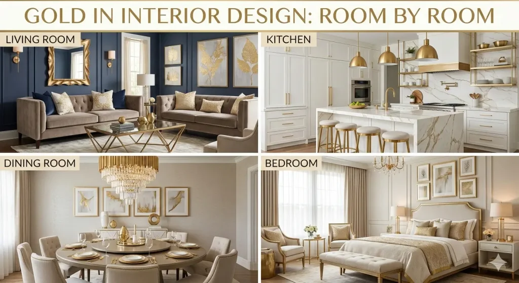
Now let’s get realistic. What is the ideal amount of gold, and where should it appear in your house?
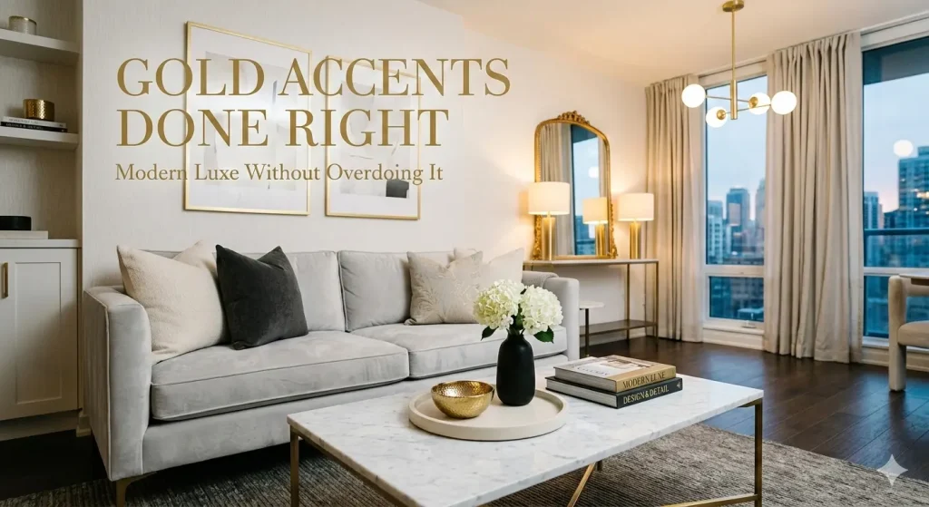
The Living Area
Most people begin their gold trip in the living room, but they also tend to go overboard there. I believe it’s best to select two or three of the room’s boldest moments and let them take the lead.
Above the fireplace is a mirror with a gold frame. Two brass table lamps. A gold-legged coffee table. After you’ve decided on your players, let the rest be supporting actors. Your rug, wall color, and fabrics should all enhance the gold rather than overpower it.
Using gold to create a visual triangle in the space is a trick that designers adore. Your gold accents should be positioned at three distinct heights and places. This naturally guides the eye throughout the room and establishes a sense of balance. It appears deliberate without being formulaic.
Additionally, please don’t match everything for the sake of appealing design. Your gold lamp does not need to match your gold picture frame, and your picture frame does not need to match your gold drawer pulls. In fact, a little variance in tone and finish gives a room a more polished and collected appearance. It’s the matchy-matchy gold that gives rooms the feel of a showroom instead of a house.
The Kitchen
Adding gold hardware is one of the easiest and most noticeable improvements you can make to kitchen cabinets. Do white, blue, forest green, or black cabinets have brass or brushed gold pulls? It’s like receiving a kiss from the chef. Without requiring a complete makeover, it instantly updates a kitchen and gives it a posh vibe.
However, bear in mind that even if your hardware is gold, a gold faucet, gold light fixtures, and gold bar stools are not essential. Allow the kitchen to breathe by emphasizing one or two gold components. Gold cabinet handles and a gold faucet? Gorgeous. Add a cluster of gold pendant lights. Perhaps. Add a gold kettle, a gold fruit bowl, and gold bar barstools. The plot has escaped you.
The restroom
Bathrooms are often smaller spaces, which makes them ideal for incorporating gold accents. Gold shower hardware, towel bars, and faucets contrasted with white marble or subway tile are a timeless combination. It’s tidy, timeless, and takes amazing pictures.
In restrooms, consistency is crucial. Bathrooms appear best when all of the metal fixtures match or have fairly similar tones, unlike living rooms, where a mix of gold tones can work. It appears disorganized to have a rose gold mirror frame adjacent to a polished gold towel ring and a brushed gold faucet. Decide on one gold finish and make a commitment.
The Bedroom
In a bedroom, gold should be delicate, welcoming, and almost romantic. Big, eye-catching gold statement pieces are not appropriate here, unless that’s really your style, in which case go for it. Consider drawer handles on your nightstands, a delicate gold-framed poster above the bed, or bedside lamps with gold tones.
A slim full-length mirror with a gold frame that leans against the wall is one of my favorite gold moments in the bedroom. It is easy to use, warms a neutral bedroom just enough, and doesn’t try too much. When you combine it with natural wood furniture, soft white linen, and some greenery, you can create a room that has the impression of a boutique hotel without the high price tag.
Gold in Fashion and Personal Style
Gold touches also apply to your attire, so let’s take a brief break from the house. The same guidelines—restraint, aim, and understanding when enough is enough—also apply.
Jewels
When done correctly, the layered gold jewelry design is still popular and elegantly stylish. The key? Change up your lengths and thicknesses, but don’t overdo the volume. Three varying lengths of delicate gold necklaces? Gorgeous. A gold belt, two bracelets, four rings, three necklaces, and gold earrings? A human chandelier is what you are.
You don’t have to feel obligated to choose all gold pieces. The quality of gold-plated and gold-vermeil jewelry has improved dramatically in recent years. Numerous companies produce exquisite items that have an opulent appearance and feel without being expensive. The way you wear it is more important than the carat.
Clothes
The ideal use of gold in apparel is as an accent rather than a headline. Consider incorporating subtle gold buttons into a jacket. Consider incorporating a belt with a simple gold fastening. A slender gold-strapped pair of shoes. These minor accents provide an ensemble refinement and sophistication without giving the impression that you’re going to a costume party.
If you choose to wear a gold item, such as a gold blazer, shirt, or pleated skirt, make it the focal point. Use neutral colors like cream, navy, camel, white, or black to build the rest of your ensemble around it. The focal point is the gold piece. Every other thing regresses.
Add-ons
A gold purse is perfect for a night out. A gold-tone-faced watch. narrow gold-framed sunglasses. Gold accents like these enhance your appearance without overpowering it. What’s the common thread? These accents serve a purpose beyond their gold color; they are specific and small in size.
Color Pairings That Make Gold Sing
Gold doesn’t exist in isolation. What you place next to it is vital. The following color combinations enhance gold to its fullest potential:
Gold and White: Simple, ageless, and classic. It is nearly impossible to get this combination wrong. White allows gold to shine without drawing attention to itself.
Gold + Black: Unquestionably elegant, daring, and dramatic. This combination looks especially good in rooms with a modern or Art Deco feel. Despite the striking contrast, there is never a sense of chaos.
One of the most elegant color schemes in the world of design is gold and navy blue. There’s a reason why posh interiors, premium packaging, and luxury branding all use it. Gold looks majestic without being stuffy on the deep, rich backdrop of navy.
Consider this: Gold and forest green is a combination that is frequently found in nature. Sunlight is coming through the foliage. Green goes well with gold because it feels warm and natural. It’s a particularly fantastic combination for bedrooms and living spaces.
Blush pink and gold: delicate, feminine, and contemporary. Although it works equally well in ordinary interiors, this combination has been a favorite for wedding and event decor. For the most elegant effect, keep both tones subdued and gentle.
Gray is perhaps the finest neutral companion to gold. The warm tones of gold and the cool tones of gray produce a lovely temperature contrast that seems balanced and mature. From wardrobes to kitchens, this combination looks excellent everywhere.
Gold contrasted with creams, taupes, and warm beiges creates a subtle, “old money” look that’s been popular lately. It doesn’t try too hard and is subtle and sophisticated.
What are the colors to avoid? The combination of red and gold can quickly turn into a celebration. Gold and orange might appear murky. Additionally, combining too many metallics—such as rose gold, copper, and silver—with gold might result in an untidy appearance. It is undoubtedly a tightrope walk, but not impossible to accomplish.
Common Mistakes to Avoid
Let’s discuss what not to do because sometimes the “don’ts” are more useful than the “do’s.”
Avoid matching everything. I’ve said it before, but it’s worth saying again. Accents of gold that match perfectly appear manufactured rather than carefully chosen. Allow for minor variances.
Remember to consider scale. In a vast space, a small gold accent will be lost. A large gold piece will take center stage in a tiny space. When deciding on the size of your gold components, take your room’s dimensions into account.
Keep your eyes on the rest of the room. When your home has a strong base, gold accents look their best. No amount of gold will salvage your room if it lacks a sensible structure, a unified color scheme, and adequate lighting. Prioritize the fundamentals before adding the gold as a final touch.
Don’t adhere to all trends. You don’t really need a gold geometric terrarium in every area, even though they were popular on Pinterest in 2017. Select gold pieces that truly complement your style and your room rather than ones that are only in style at the moment.
Don’t cover up quality with gold. Just because a piece of furniture is gold doesn’t make it opulent. Low-quality gold finishes, such as those that flake, tarnish unevenly, or appear plasticky, will actually make your room appear less expensive rather than more expensive. One well-made gold accent is preferable to five cheap ones.
The Mindset Shift: Gold as Punctuation
I want to leave you with this mental model. Consider gold as a sentence’s punctuation.
The line goes, “Your room, your outfit, your event design.” It is composed of words (your layout, your furniture, your color scheme, and your textures). The punctuation is gold. The symbol is an exclamation point. There is a comma at the right position. Perhaps a tasteful semicolon could be used to connect two lovely concepts.
The sentence is not made up of the punctuation. The words work. However, even the most exquisitely constructed statement is ineffective without punctuation. Additionally, excessive punctuation makes it impossible to read.
The same is true for gold. It’s not the narrative. These details provide the story’s flow, intensity, and moments of pause and admiration. You’ll never go overboard when you approach gold with that mentality—as a supporting player rather than the protagonist.
Final Thoughts: Trust Your Eye (But Edit Ruthlessly)
Design is ultimately a personal matter. What one person considers “too much” may be “just right” to another. And that’s okay. These regulations aren’t inscribed on stone tablets. They serve as rules and safeguards for situations when you are holding a gold vase in a store and wondering if you have too many.
What’s the finest advice I can give? Edit whenever possible. Add a touch of gold to your room. Take a step back. Examine it. Put up with it for a day or two. Keep it if it adds coziness, intrigue, and a sense of completion to the space. Remove it if it makes the space seem heavier, busier, or like it’s trying too hard.
Gold is abundant. To have an impact, it doesn’t have to be everywhere. Leaving space is sometimes the most opulent thing you can do. Allow the gold to breathe. Allow it to silently introduce itself when it catches the light from the other side of the room.
Having the most was never the definition of true luxury. It all comes down to recognizing the difference and having just enough.