This article explores how three simple ingredients are quietly redefining what luxury looks like—and feels like—in today’s homes.
Sometimes you enter a room and everything effortlessly aligns. You can’t tell right away why it feels so fantastic. The space isn’t yelling at you. There isn’t a small car-sized chandelier hanging from the ceiling. No marble on everything. There are no velvet ropes hanging from the ceiling. But nevertheless, it still feels quite fancy.
You fall into it. You find yourself breathing a little easier. You think, “I could live here.”
That space was probably designed using a formula that has been slowly gaining popularity in the design community for the past few years. It doesn’t stand out. It’s not based on trends like all-pink kitchens or gallery walls with a lot of stuff on them. It’s more delicate than that. More grounded.
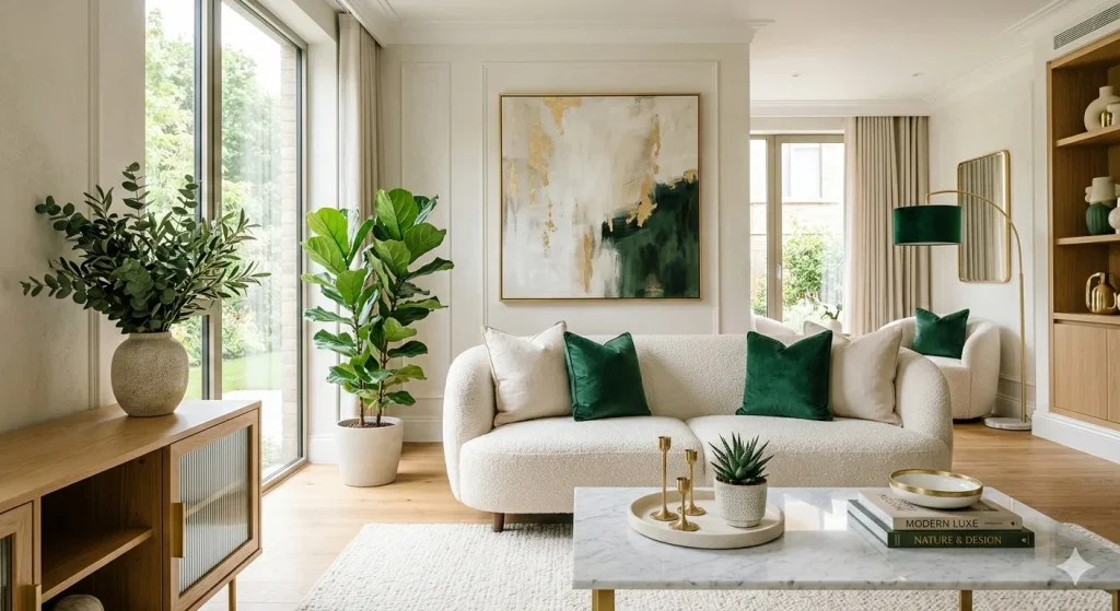
It’s the modern luxury formula: warm whites, greens, and gold that isn’t too bright.
When you put these three things together with intention, they make places that feel both high and very human. Instead of shouting, they whisper luxury. And the best part? They fit in with almost any room, budget, and style, from a small studio apartment in Brooklyn to a huge farmhouse in the English countryside.
Allow me to elucidate the effectiveness of this formula, its application, and the current attraction it holds for us.
Why These Three? The Psychology of the Palette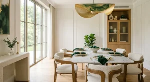
Let’s take a step back before we talk about paint swatches and toss pillows. The charm of this mix isn’t only how it looks; it’s also how it makes you feel.
Warm whites are not the bright, sterile whites you see in a hospital hallway or an art museum. The whites have a little of cream, a hint of beige, and a hint of warmth baked right in. Think about the hue of a cappuccino that has been steamed just right. The hue resembles the interior of a shell. A linen shirt that has been washed a hundred times and is still soft.
These warm whites do something amazing to a room: they make it feel bigger without taking anything away. Under the wrong lighting, cool whites can feel empty or even a touch hostile. Warm whites, on the other hand, feel like an embrace. They make a canvas that is not empty but alive.
Greens, from deep forest to delicate sage to somber olive, all tap into something deep inside us. In our core, we are creatures that inhabit the natural world. Green is the color of health, development, rest, and new beginnings. Studies have proved again and again that being among green tones lowers stress, lowers heart rate, and makes people feel better. When you add green to a space, you’re not only making it seem nice. You’re making a safe place.
And then there’s the gold. It’s not the same as a rap video where gold is used. It’s not the same as the Versace wallpaper. Controlled gold is what I mean. It can be seen in a brushed brass faucet, the slender frame of a mirror, a single light fixture, or the veining in a piece of natural stone. This particular type of gold defies convention. It makes a point. It catches the light and says, “Yes, someone thought about this.” Someone cared.
Gold makes everything it touches better when used sparingly, enhancing the overall aesthetic and emotional experience of a space, which contributes to creating an environment that feels both inviting and intentional. It’s the difference between a place that feels “nice” and one that feels “thoughtful.”
These three things—warmth, life, and light—work together to make a healthy ecology. Comfort, nature, and style. That’s how it works. And it looks like it’s easy.
The Move Away from Cold Luxury
To understand why this formula is so popular right now, it’s helpful to look at what happened before it.
For years, even decades, the most popular luxury design used a cooler color scheme. Think about living rooms with gray walls and gray floors. Consider kitchens that are pristine white, devoid of any signs of activity. Chrome hardware. Black details. Steel and glass. Yes, it looked wonderful in pictures. But it was chilly, and over time, it started to wear people down.
A few years ago, I went to a friend’s recently remodeled flat. Everything looked like it belonged in a magazine. The couch is made of grey velvet. The coffee table is made of marble. The one-color palette. And she looked at me with a look of defeat and said, “I don’t know why, but it doesn’t feel like home.”
I remember that moment because I assume many other individuals were having the same epiphany at the same time. The era of all gray had reached its peak. The pendulum was starting to move.
And where did it go? To warmth. To nature. Toward places that didn’t just appear wonderful in pictures but also felt good to be in.
In many ways, the modern luxe formula is a direct response to the frigid luxury of the last decade, as it seeks to create environments that are not only visually appealing but also evoke a sense of warmth and comfort. The modern luxe formula also preserves the clean lines and the feeling of curation, which is the “modern” side, but also adds some soul to it by incorporating elements that evoke warmth and comfort, such as natural materials and inviting color palettes. With a breath. With life.
It’s a privilege for individuals who really live in their homes.
Warm Whites: The Base of Everything
Let’s get real. You can only use a formula if you know how to use it.
Warm whites are the base of your look. The walls, ceilings, big upholstered pieces, and bedding are all theirs. They are the setting for everything else to happen, creating a cohesive backdrop that enhances the overall aesthetic of the space.
But people often err here: not all warm whites are alike, and you must consider your space to choose the right one.
The warm white you pick should work with the light in your room. Whites with a yellow or peachy undertone, like Benjamin Moore’s “White Dove” or Farrow & Ball’s “Pointing,” work well in north-facing rooms because they tend to get cooler, bluer light. Whites with a slightly grayer or greener base, on the other hand, work well in south-facing rooms because they are already bathed in warm light.
The idea is to make a tone that seems like natural light: soft, warm, and easily lovely.
And here’s something I learned after years of trying: don’t simply utilize your warm white in one texture. If every surface in a warm white room has the same finish, it could feel flat. But when you add layers, like a linen sofa, a thick wool throw, a ceramic vase, and a plaster coffee table, that one hue suddenly has depth and complexity. It turns into a live, breathing background.
This is when the “luxe” part starts. It’s not about how much you spend on luxury. It’s about how much time you put into it. And a warm white space with a lot of texture makes you think.
Greens: The Beat of the Space
If the canvas is warm white, the heartbeat is green. It gives the room life.
When I say green, I don’t mean green walls all the time (though they can look wonderful in the proper setting). In the modern luxury formula, green appears in layers, and a lot of those layers are real plants.
This formula must have living plants in it. A fig tree, adorned with delicate fiddle leaves, can be found in the corner. A pothos plant is suspended from a shelf. A bouquet of herbs adorns the kitchen windowsill. A vase filled with fresh eucalyptus completes the scene. These aren’t just lovely things; they are part of the room’s mood. They make the air cleaner. They make sharp edges less sharp. The seasons change them in small ways. They remind us that our homes are not apart from the rest of nature.
But green can also be seen in paint, clothing, art, and ornamental items.
Sage green, in particular, has become a key color in this palette. It strikes the right balance between the neutrality of warm white and the richness of darker greens. The kitchen island features a shade of sage green. A curtain made of sage linen. The cream-colored sofa is adorned with a sage throw pillow. It looks classy without being stuffy, natural without being rustic, and it goes well with both warm whites and gold.
Deep forest green and dark olive are excellent accent colors for people who desire more drama in their modern luxury. A forest green accent wall in a bedroom, along with soft white bedding and brass bedside lamps, makes the room feel like you’re sleeping in a very fancy treehouse. And I say that it’s the best thing I can say.
The goal is to make it feel inevitable, no matter what shade of green you use. It shouldn’t look like you pushed it in. It should look like it grew there. Like it should.
Gold Control: The Skill of Restraint
This is when many individuals either get the recipe right or completely lose it. Because gold is strong. And strong things need discipline.
Controlled gold is using metallic warmth as an accent, not as a main element. It means picking one or two spots in a room where gold will stand out and then stepping back.
Here’s what controlled gold looks like in real life:
Hardware. Cabinet pulls, door handles, and drawer knobs are made of brushed or satin brass. Using hardware is the easiest and most effective way to add gold. There is a little bit of beauty every time you open a drawer.
Light. A brass pendant hangs over the kitchen island. The hall features a sconce with gold arms. A brass floor light sits adjacent to the couch. The gold here doesn’t feel like decoration; it feels like it has a purpose.
Mirrors and frames. A thin gold frame encircles a piece of art. A spherical mirror made of brass at the doorway. These little things provide the impression of curation without going overboard.
Details on the furniture. The side legs of a table are an example of this. A lamp’s base lends an air of refinement. A tray’s trim lends an air of refinement. These little things make a room go from “put together” to “polished.”
Gold wallpaper, gold furniture, and gold everything else—they do not control what gold looks like. When gold becomes the most important thing, you’ve moved from modern luxury to something else. And that other thing often seems forced, which is the reverse of what we want, as it can create an atmosphere of excess rather than elegance, leading to a perception that the space lacks sophistication and balance.
You should think of gold like a cook thinks of truffle oil. A few droplets can change a dish. Drinking half a bottle of gold destroys its value.
The finish is important too. When it comes to modern luxurious formulas, gold is more likely to have a brushed, satin, or antiqued finish than a high-polish or mirror-finish finish. The answer is simple: matte and brushed finishes feel more natural, lived-in, and human. They don’t shout for attention. They just shine.
Room by Room: Making the Formula Real
One of the best things about this formula is that it can be used in many ways. It fits in with every room in the house without losing its shape.
The walls are a warm white color, and the sofa is a creamy color. Add green with plants, an olive or sage accent chair, and maybe a piece of botanical art. A brass floor lamp and several pictures in gold frames on a shelf finish the look. The outcome is a place that is ideal for both watching TV on Tuesday nights and having people over on Saturday nights.
Warm white cabinets (or even a warm white stone countertop) in the kitchen keep things light and open. Adding a sage green island or backsplash tile gives the room character. The brushed brass hardware and the solitary statement pendant give it the controlled metallic warmth that ties it all together. A dish of green apples or a pot of rosemary will make your kitchen look and feel pleasant.
This combination is particularly effective in the bedroom. A deep green wall behind the headboard and warm white bedding, like linen, provides the perfect imperfect texture. A lamp for reading is made of brass. There is a tiny plant on the nightstand. It could be appealing to have an olive green throw at the foot of the bed. The result is a room that tells you to relax. You’re safe. And really, what’s more luxurious than that in a world as loud as ours?
In the bathroom, green vanity cabinets or green patterned floor tiles go well with warm white tiles (subway, zellige, or big format). A brass-framed mirror, brass faucet, and brass towel hooks give you those golden moments that you can control. It’s not just attractive on Pinterest to have a eucalyptus branch hanging from the showerhead; it also delivers calming scents in the steam. Beauty and function. That’s how the formula works.
There is a warm white wall, a round brass mirror, a tiny console table with a green plant, and brass hooks for jackets in the foyer. It only takes five minutes to put together, yet it sets the mood for the whole house. This first impression says, “Welcome.” We care about this area. And we’re thrilled to have you here.
Why It Feels So Good Right Now
I think this formula has become popular for more than just how it looks.
We’ve been through a lot. A global pandemic forced us to scrutinize our homes for months on end. Uncertain economic conditions forced many of us to reevaluate our definition of what is truly worth spending on. The pandemic led to a societal awakening about excessive consumption, fast fashion, and the tendency to discard items.
In the middle of all that, things changed. We stopped wanting our homes to make other people jealous and started wanting them to take care of ourselves.
The current luxurious formula meets that need. It’s not about bragging. It’s about being there for yourself, for your daily life, and for the quiet times that make up most of our lives.
Warm whites make you feel peaceful. Greens feel like living. Gold feels like love.
When you put them together, you get something that is more than just a color palette. You learn that luxury isn’t the same as excess. Luxury is a choice.
Mistakes That Happen Often (and How to Avoid Them)
If you’re not careful, even the best formula can go wrong. Here are some mistakes I’ve seen and made myself, to be honest.
Mistake #1: Making the white too chilly. If your white has a blue or purple undertone, it will clash with the gold’s warmth and the green’s earthiness. Before you buy white paint, always try it out in your real environment, both in natural and artificial light. A small sample in the store might look warm, but an entire wall might look cold.
Mistake #2: There are too many colors of green. It can seem beautiful to mix greens, but it can also look messy if there isn’t a clear line. Choose one main green color, like sage, and then add a richer accent green, like forest or emerald, to support it. When there are more than two or three different shades of green in a space, it starts to feel like a botanical garden, and not in a good way.
Mistake #3: Putting too much gold on. I’ve said it before, but I’ll say it again. Each piece of gold should earn its position. It probably shouldn’t be there if you can’t explain why it’s there. A beneficial rule of thumb is to have three to five golden moments in each room. That’s all. Give them some space.
Mistake #4: Not thinking about texture. If you build a room using this method but only use smooth, flat surfaces, it will feel like a hotel lobby. Nice, but not personal. The texture is what makes this look work. It has natural wood, handcrafted pottery, woven baskets, linen, wool, and stone. These uneven surfaces reflect light in diverse ways, age well, and create a truly lived-in feel in a room.
Mistake #5: Not paying attention to the lighting. Even the most gorgeous color palette will look awful under intense overhead light. Buy bulbs with a warm tone (2700K is the best color), and use a combination of overhead, task, and ambient lighting to make your space feel more inviting. Candlelight is undoubtedly the most effective lighting solution. The flicker of a candle is the best way to make warm whites glow and gold shine.
How to Make It Yours
The formula is not a prison; it’s just a beginning point.
Instead of live plants, maybe your idea of green is a collection of old botanical prints. You might just have one inherited candlestick from your grandmother who has gold in it. Your warm white could be a wall that was hand-plastered with apparent brushstrokes, or it could be a sleek, smooth, modern finish.
The formula works because it is based on timeless ideas like warmth, nature, and light. How you express it is up to you.
I’ve seen this color scheme work in both simple Scandinavian homes and Parisian flats with many layers. I have seen it in a small bathroom remodel that cost a few hundred dollars and in a full-home overhaul that cost a lot more. The beauty isn’t based on the budget. The intention does.
One Last Thing
We live in a time when there are endless options. There is an infinite variety of paint colors available. There are endless choices for furnishings. Pinterest boards, Instagram saves, and TikTok design hacks that never end. It can make you feel frozen.
The modern luxe combination, which includes warm whites, greens, and restrained gold, cuts through all that noise. It offers you a structure. A place to begin. It provides a set of rules that, paradoxically, enable you to create something truly unique and undeniably stunning.
Your home doesn’t have to look like a magazine at the end of the day. It should feel like you are at your best, most rested, and cared for.
And what if a little sage paint and a brass lamp may help you get there? That sounds like a fairly excellent plan to me.