A palette that connects indoors and outdoors
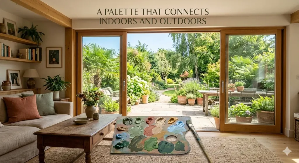
You know what I mean if you’ve ever been there: You walk through a wonderfully designed home, and everything just seems perfect. The sliding glass door doesn’t finish the living room. The patio doesn’t mark the start of the garden. Instead, there’s this invisible thread that ties everything together, making the whole property feel like one big, breathing place.
More specifically, it’s a carefully chosen color scheme that unites the inside and outside, blurring the distinctions between four walls and the open sky. It’s not about making your fence the same color as your couch. It’s a lot more complex, intuitive, and fascinating than that.
If you’re building a new home, remodeling, or just searching for ways to make your room feel bigger, knowing how to connect the colors of your inside and outside spaces can change the way you live. Let’s discuss its true meaning, how to do it right, and why it matters more than most think.
Why the link between the inside and outside is important
Before we go into specific colors or procedures, let’s stand back and ask ourselves, “Why does this matter?”
People are very connected to nature. Biophilic design, or adding natural features to buildings, has been researched a lot, and the results are very evident. People are calmer, more focused, and happier in environments that connect them to the outside world. The benefits keep coming: less stress, a better mood, better sleep, and even more creativity.
Many people don’t get this, but biophilic design isn’t simply about putting in a few plants and calling it a day; it involves creating a harmonious relationship between indoor and outdoor spaces that enhances well-being and fosters a deeper connection to nature. The way your home’s internal rooms flow into the outside world through your windows has a big effect on how connected to nature you feel while you’re inside.
When the colors in your home clash with the colors outside your windows, you may feel a slight but constant sense of detachment. Your brain notices that change. The room feels more closed in and boxed in. You look at the outer world instead of feeling like you’re a part of it.
But when colors move naturally from room to garden or from hallway to courtyard, something beautiful happens. It looks like the walls are getting smaller. The room seems bigger. The line between man-made and nature gets softer, nearly see-through. Your house ceases being a box you live in and starts being a part of the landscape surrounding it.
That’s what a connected palette can do. It’s easier than you think to get it right; just choose colors and materials that match your surroundings’ natural and architectural features.
Reading Your Landscape: Starting with What’s Already There
People often make the mistake of thinking of the inside of their home as a separate canvas when picking colors. They go through magazines and scroll through Pinterest, falling in love with a dark charcoal living room or a bright coral kitchen, and they don’t even look out the window.
My advice is to start outside.
Take a walk around your property. Stand in your lawn, on your porch, or in your garden. What do you see? What colors stand out the most in your natural surroundings?
If you reside in a green environment with big trees and rolling grass, your scenery is made up of deep greens, mossy tones, and earthy browns. If you live near the ocean, you can use sandy neutrals, gentle blues, silvery greens, and the bleached whites of driftwood and shells. People that live in the desert have terracotta, ochre, dusty sage, and a lot of warm beige. In cities, you might see gray concrete, worn brick red, and dark green trees.
Your landscape is already speaking in colors. Your task, which is one of the best parts of designing a home, is to learn that language and bring it inside.
This doesn’t mean that the inside of your house has to look exactly like the outside. It involves picking colors that go well with the things around you. Colors that echo, go well with, or respond to the tones that are present in your home.
Picture it like music. Your landscape is making music. Your interior colors should complement the landscape, rather than conflict with it and create a dissonant effect.
What Natural Light Does
Light is an important part of color that connects the inside and outside. Natural light is the most significant thing that affects how a color looks and feels in your home. It is also the actual connection between your home and the outside world.
Natural light quality varies by location, window orientation, season, and weather. The light from the north is usually colder and gentler. The light from the south is warm and kind. Rooms that face east get soft morning light, whereas those that face west get bright afternoon light.
This perspective is important since the same paint color can look very different in different lights. In a south-facing living room, a warm taupe color might look appropriately grounded and earthy. In a north-facing bedroom, it might look frigid and a little purple. A light blue that feels airy and seaside beside a big west window could look clean and antiseptic in a room with not much light.
When you’re developing a color scheme that connects the inside and outdoors, pay special attention to how natural light comes into each space and how it changes during the day. The colors you pick should look and feel good in the light they’ll be in. If a space gets a lot of warm afternoon sun, using warm neutrals and soft earth tones will make it feel even more like you’re outside. If a room looks out over a shaded garden, colder greens and gentle grays will look more real.
The aim is to make it easy to switch from looking at your room to the window. If the color temperature in your room differs significantly from the light coming through the glass, it will appear unnatural, even if you’re unable to pinpoint the exact reason.
How to Build Your Connected Palette: A Practical Guide
How can you effectively create this palette? Let me show you a method that works whether you’re paying a designer or doing it all yourself.
Step 1: Find Your Anchor Colors
Take pictures of your property at different times of day while you’re outside. Take pictures of your garden, the views from important windows, and the materials used on the outside of your house, such as stone, wood, brick, or render. Look at these pictures together and pick three to five colors that make you think of the outdoors.
These are the colors that will hold you down. They don’t have to be perfect copies of what you see outside; in fact, they’re usually better when they’re softer and less bright. If your landscape has a lot of bright green leaves, a muted sage or olive would be a good color for your home. If your outside walls are made of warm sandstone, a creamy warm white or a light wheat tone could be your inside anchor.
Step 2: Set up your neutral base.
A solid neutral base is needed for any connected palette. The neutral base is the canvas that holds everything together and keeps the room from feeling cluttered or messy. Your neutrals should match the temperature of your surroundings. When the weather is warm, you should choose warm neutrals like creams, warm whites, soft taupes, and mild ochres. Cool landscapes tend to use colder neutrals, like soft grays, blue-whites, and pale stone tones.
These neutrals will likely cover most of your interior surfaces, including walls, ceilings, large furniture, and floors. They provide the calm background that lets your accent colors and the vistas from your windows shine.
Step 3: Add your nature-inspired accents in layers.
Once you have a neutral base, add accent colors that come from the outside world. This phase is when things start to get intriguing. Consider your garden’s colors, hardscaping materials, and the sky at different times.
A home with lavender and rosemary around it can have gentle purples and dusty blue-greens in its linens, cushions, and art. If you have a lot of natural wood in your home, you could get rich wood tones from furniture, shelves, or feature walls. A house with a view of the ocean might utilize different shades of blue, from light sky to dark navy, as accents around the house.
The secret is to carefully and on purpose layer these accent colors. You’re not copying the outdoors; you’re making echoes of it. An olive green cushion on a linen sofa, a terracotta vase on a wooden shelf, and a piece of art that shows the steel blue of a winter sky are all subtle, thoughtful details that make the inside and outside feel like they’re talking to each other.
Step 4: Think about your transition areas.
Your entryways, porches, patios, covered decks, sunrooms, and conservatories are all places where the indoors and outside actually touch. These areas need special care. These transition zones are where the palette link is strongest and most important.
The color palette in these areas should look like a real mix of inside and outside. Here, materials and colors from outside might be more directly present. The natural stone floors extend from the patio to the kitchen. The same wood that was utilized for the outside cladding is now an internal feature wall near the back entrance. The hues of the outdoor chairs match the colors of the living room next door.
You can even blur the distinctions even more in transition zones by using indoor-outdoor rugs, weather-resistant materials, and long-lasting finishes. The more smoothly the colors and materials in these areas flow together, the more the whole house feels like one big space.
Step 5: Don’t Forget About Texture
The color is merely one element of the story. Texture is essential for connecting indoor and outdoor environments since the natural world is full of textures, such as rough bark, smooth river stones, soft moss, worn wood, and delicate petals.
Adding natural textures like raw linen, jute, unpolished wood, stone, woven rattan, and hand-thrown pottery to your home will make the color connection stronger. A sage green wall with a rough linen curtain looks and feels very different from the same wall with a shiny synthetic curtain. The first one makes you feel like you’re in nature. The second one feels like a design choice that just happens to be green.
Adding texture to your palette gives it more depth and honesty. It makes the link between the inside and outside feel real, not fake.
Three Examples of Using Palettes
Let me quickly draw three images to explain how this works in different places.
- The House on the Coast
Outside, there are sandy dunes, a gray-blue ocean, bleached driftwood, and patches of beach grass that are silver-green. Your neutral foundation color is a warm sandy white, like the color of dry sand at noon. The colors that stand out in your room come from the water and the sky. For instance, you can incorporate a gentle blue-gray for a feature wall, faded indigo for pillows, and hints of silvery green in eucalyptus arrangements and pale sage pottery. Bleached oak, natural linen, woven jute, and raw cotton are the materials used. The floor is made of light-colored wood that looks like driftwood on the beach. You can hardly tell where the living room ends and the beach begins when you stand inside and look out through the floor-to-ceiling windows. - The Forest Getaway
There are tall pines, mossy ground cover, fern fronds, and diffused light coming through the canopy outside. The neutral foundation color is a warm putty or mushroom tone, like the hue of tree bark and dry leaves. Deep forest greens, warm amber, and hints of charcoal are the accent hues. They remind you of wet stone and trunks that are in the shade. Wood that has been stained dark, leather, wool, and brushed concrete are all used. A big window lets you see the trees, and the colors inside match wonderfully. For example, the green of a velvet recliner matches the green of the ferns just outside, and the amber of a pendant lamp matches the late afternoon sun shining through the branches. - Villa in the Mediterranean
There are terracotta roof tiles, whitewashed walls, olive trees, and bougainvillea outside. The neutral foundation within is a chalky white with a very light warm undertone, like plaster that has been in the sun. Terracotta (of course), deep olive green, dusty rose, and sun-faded gold are the accent hues. The materials are aged wood, wrought iron, handmade textiles, natural clay tiles, and raw plaster. You can see the garden through the arched doorways, and the terracotta pot on the dining table looks much like the terracotta tiles on the path in the garden. Everything seems to fit together in one globe.Avoid These Common Mistakes
Even with the best intentions, some factors can disrupt the relationship between your indoor and outdoor palettes.Avoid a monotonous approach. It feels forced and too literal if every color within is a direct copy of something outside. Leave some room for others to interpret, contrast, and be surprised. The relationship should feel natural, not planned.
The seasons should not be overlooked. If your palette is appropriate for your yard in the summer but doesn’t take into account the sparse branches of winter or the golden tones of fall, it will only feel linked for part of the year. Make your palette based on the things in your landscape that stay the same all year, like the evergreen trees, the stone, the soil, and the sky. Seasonal flowers and leaves can be extras instead of the main things, as they provide temporary beauty that complements the enduring elements of your landscape throughout the year.
Not thinking about evening. When the windows turn into gloomy mirrors, your palette needs to work. After sunset, the rooms will feel empty if your whole color story is based on the scenery outside. Make sure your interior colors are bold and appealing on their own, and add artificial lighting that makes the space feel warm and inviting as the sun goes down.
Selecting colors independently is crucial. Don’t choose a paint color by glancing at a little sample under fluorescent lights at the hardware store. Always try out colors in the room itself, at different times of day, and with the view from the window as the background. At 4 PM in November, what looks wonderful on a fan deck could appear absolutely incorrect on your wall.
Do not neglect the exterior of your home. The paint, trim, front door, and landscaping on the outside of your house are the first chapter in your color story. The transformation will always feel sudden if the outside has nothing to do with the inside. Consider the outside color scheme as an integral part of the entire design, not an afterthought.
The Emotional Effect of a Connected Palette
I want to end with something less tangible but, in my view, more important than any design rule or method.A home with a color scheme that connects the inside and outside looks beautiful. It feels fantastic. Being in a space that fits in with its surroundings gives you a sense of peace. Living with hues from the earth, the sky, and the natural world gives you a sense of stability.
When so many of us spend most of our days inside, looking at screens, surrounded by artificial light, and cut off from the cycles of nature, making a home that keeps a real visual and emotional connection to the outside world is more than just a style choice. It’s a good thing to do.
The soft green of your walls in the living room echoes the garden outside the window, the warm wood of your dining table mirrors the fence and trees, and the blue of your bedroom curtains reflects the sky you’ll see when you first open your eyes in the morning. These aren’t just attractive design details. They remind you every day that you’re not isolated from the world around you. You are a part of it. Your house is a part of it.
That feeling of calm belonging and connection is worth a lot more than any trend, Pinterest board, or brand label.
Last Thoughts
There aren’t any strict criteria for developing a palette that connects the indoors and outside, but it is critical to think about elements such as color, texture, and natural materials that reflect the outdoor environment. It’s all about being aware. It’s about going outdoors, genuinely looking at the world around your house, and asking yourself how you might bring that sensation inside.It’s about picking colors on purpose, carefully layering textures, and being grateful for the light that nature gives you. It’s about transition zones that make the border between rooms and landscapes less clear, neutrals that set the mood, and accents that make small conversations between your rooms and your landscape.
Most importantly, it’s about making a house that doesn’t feel like a box that is closed off from the outside world but rather like a part of the world that is alive and breathing. It’s about creating a space where the boundaries between indoor and outdoor spaces are soft, seamless, and aesthetically pleasing.
Look at what’s outside your window first. Follow the path of nature. And don’t be scared to let some of the outside in.
It will be beneficial for your home and your health.