The Complete Finishes Guide Matte Satin and Metal
Have you ever struggled to make a decision while holding paint samples at a hardware store? Or maybe you’ve looked at several products online and couldn’t decide between “matte black” and “satin silver.” “You weren’t sure which one would look best in your area. You’re not the only one. It may seem like a little decision, but picking the appropriate finish can have a major effect on how everything looks, feels, and lasts, from the walls of your living room to the business cards you hand out at a networking event.
Finishes aren’t simply about how things look. They change how long something lasts, how easy it is to clean, how light interacts with a surface, and even the mood of a whole room. A matte wall may make a bedroom feel peaceful and safe. A satin cabinet can be both stylish and useful at the same time. A metal accent can transform a dull shelf into an attractive focal point that encourages conversation.
What’s the problem? Many people don’t really know what the differences are between finishes, so they just guess. And if you guess, you could end up with a kitchen backsplash that shows every fingerprint, a printed brochure that appears cheap instead of classy, or a piece of furniture that doesn’t go with anything else.
This guide is here to help. We will explain when to use each of the three most popular and adaptable finishes: matte, satin, and metal. Not too much jargon. No fancy design talk. The advice provided is practical and easy to implement.
Let’s get started.
Why Finishes Are More Important Than You Think
Before we get into the details, let’s talk about what a “finish” is in general.
A finish is basically the texture and shine of a surface. It’s the last layer that your eyes see and your hands feel. The finish is what makes a product or surface reflect light, whether it’s paint, printed materials, furniture, electronics, car surfaces, or packaging.
Sheen levels usually go from low (no shine at all) to high gloss (nearly like a mirror). There are varying levels of matte, satin, and metallic finishes, and each has its pros and cons.
Two identical tables painted the same navy blue will look and feel very different if one has a matte finish and the other has a satin finish. The hue is the same, but the experience is different.
That’s what makes finishing exceptional. They change how people see things.
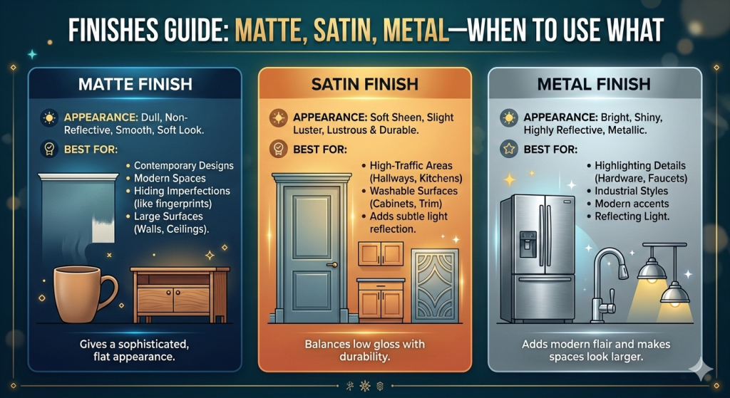
Matte Finish: The Quiet Sophisticate
What It Is
A matte finish is a surface that absorbs light and has very little sheen. It looks soft and velvety because it doesn’t bounce light back. If finishes were people, Matt would be the one sitting in the corner of a dinner party, quietly confident, effortlessly cool, and not attempting to impress anyone.
Matte finishes are ubiquitous. You can find them on walls, furniture, the outside of cars, phone cases, printed photos, business cards, packaging, laptops, and even nail polish. Their popularity has grown a lot in the last several years, in part because of the minimalist design movement and in part because people are sick of surfaces that are too glossy and dazzling.
The Good
Hides flaws really well. Matte surfaces are quite forgiving when it comes to defects because they don’t reflect light. A matte coat usually hides bumps, dents, uneven textures, and small flaws. This means that matte is a wonderful choice for walls that are older, furniture that has been fixed up, or any surface that isn’t exactly smooth.
Adds depth and richness. Colors look deeper and more saturated when they have a matte finish. Matte black isn’t just black; it’s a dark color that feels soft and sumptuous, like velvet. Deep greens, blues, and even warmer colors like terracotta and burgundy are the same.
Lessens glare. No shine equals no glare. Matte surfaces are ideal for places with a lot of natural light, such as photography backgrounds, reading materials, and screens. You know exactly why matte exists if you’ve ever attempted to read a glossy magazine under bright overhead lights.
It feels trendy and classy. High-end manufacturers tend to like matte for a reason, as it enhances the perception of quality and sophistication in their products. It says “understated elegance.” It says, “I don’t need to shout.” Think of the matte packaging on high-end makeup, the soft-touch surface on high-end computer products, or the flat paint on modern gallery walls.
The Bad Things
It shows dirt, fingerprints, and scuff marks. The funny thing is that matte hides flaws in the surface behind the finish, but it shows every smudge, fingerprint, and mark on top of it quite well. Have you ever seen cars that are matte black? Beautiful. But good luck keeping them clean. Matte kitchen cabinets are an impressive sight. Wow. This scenario is especially true if your toddler accidentally spills peanut butter on the cabinets.
Sometimes cleaning is tougher. Matte surfaces might hold dirt and filth since they aren’t as smooth and sealed as glossy or satin finishes. Sometimes, wiping them down might leave stains or harm the finish, especially with paint.
Matte finishes may not be as durable in areas with high foot traffic. Matte finishes wear down faster than glossy ones, especially in places that get a lot of use, including kitchens, bathrooms, and corridors.
When to Use Matte
Use matte paint for the walls and ceilings in the bedroom. Matte paint has a soft, non-reflective finish that makes a room feel tranquil and peaceful, which is precisely what you want in a place to sleep and relax.
Art and photography prints. Matte photo paper and prints with matte frames don’t reflect light, so you can see them from any angle. Glossy prints can’t compare to them when it comes to being “artistic.”
High-end branding and packaging. Matte business cards, packaging, and marketing materials are ideal for brands that wish to show off luxury, minimalism, or refinement. A matte-laminated card feels velvety to the touch and leaves an imprint that lasts.
Furniture with accents. A side table, bookcase, or dresser with a matte finish may ground a space without clashing with other things. It looks like it was meant to be there, but it doesn’t stand out.
Living places with minimal traffic are ideal for this type of furniture. Living rooms, studies, and guest rooms are ideal for matte finishes, as they endure less wear and tear than kitchens and baths.
Matte finishes are ideal for rooms that receive ample natural light. Matte finishes soften harsh sunlight and stop glossy surfaces from making rooms look washed out when the sun is shining.
Satin Finish: The Best of Both Worlds
What it is
Satin is in the middle of the sheen continuum, between matte and semi-gloss. It has a soft shine, like the surface of a pearl or a piece of silk. It reflects some light, but not enough to provide bright spots or mirror-like reflections.
Satin is the ambivert, which means it can fit in anywhere, is adaptable, and is appealing to everyone. Matte is the quiet introvert, and Gloss is the boisterous extrovert. The finish is what makes it work with other things, allowing it to complement various styles and materials in design projects, such as modern, rustic, or minimalist aesthetics.
The Good
The finish is both flexible and easy to work with. Satin finishes look appealing in almost any situation. They work well on walls, trim, furniture, cabinets, doors, and even the outside of a building. They have a subtle shine that makes them more visually interesting than matte, but they don’t show flaws as much as gloss.
Compared to matte, satin surfaces are easier to clean. Satin surfaces have a little shine that makes them seem smoother and less likely to get dirty and stained than plain surfaces. You don’t have to worry as much about streaking or ruining the finish when you wipe off satin walls and surfaces. This feature makes satin a good choice for homes with kids, dogs, or both.
Strong. Satin finishes usually last longer than matte finishes, especially in places that get a lot of wear. People often recommend satin finishes for hallways, kitchens, bathrooms, and kids’ rooms due to their resistance to scuffs and wear.
Satin finishes effortlessly infuse a room with warmth. Satin reflects light in a soft, appealing way. It offers surfaces a soft glow that makes a room feel warmer and more three-dimensional without being too shiny. It gives a room a professional look without making it feel cold.
It complements almost any color scheme. Satin makes everything look better without being too much, whether you’re using neutrals, bright hues, or pastels. It’s one of those finishes that really goes with everything.
The Bad
The drawback is that satin tends to highlight application issues. Satin hides flaws on the surface better than shine, but it can show brush strokes, roller marks, and uneven application. If you’re painting with satin, the way you do it is important. You have to apply it evenly and carefully, or the slight shine will show every flaw.
Satin is not as dramatic as gloss or matte finishes. It’s safe to choose satin, but sometimes safety can be boring. It doesn’t have the dramatic, somber look of matte, and it doesn’t have the eye-catching shine of a high-gloss or metallic finish. Satin may appear too neutral if you’re looking to create a bold statement.
In some situations, it can look “plastic.” A smooth finish can make some surfaces, especially cheaper ones, look a little fake or like plastic. When you use satin, the quality of the material below is really important.
When to Use Satin
The kitchen and bathroom. These areas get a lot of activity and have a lot of wetness, so they need a finish that can handle regular cleaning. Satin paint on cabinets and walls is the perfect mix of flair and usefulness.
Doors, trim, and molding. When it comes to woodwork and architectural features, satin is the best finish. It brings out the shape and craftsmanship of trim without the glare of gloss.
Kids’ rooms and playrooms benefit greatly from this finish. Let’s be honest: kids are untidy. You can wipe off satin walls over and over again, and they still look wonderful after years of use.
Furniture that is used every day. Satin finishes are long-lasting and easy to clean, which makes them great for dining tables, kitchen islands, desktops, and coffee tables.
Outside surfaces. Satin exterior paint can handle rain, UV rays, and changes in temperature effectively. It also does a better job of hiding the flaws in exterior materials than shine, making it a preferred choice for homeowners looking to enhance the aesthetic appeal of their properties.
Packaging is crucial for products that need to look good and be easy to read. Satin lamination on printed documents makes them look more professional and polished without the glare that can make glossy print hard to read.
The Statement Maker in Metal Finish
What It Is
A metallic finish looks like metal, such as gold, silver, copper, bronze, brushed steel, or chrome. You can get these finishes by using real metal plating, metallic paint, foil stamping, metallic laminates, or special coatings that have microscopic metal particles or reflecting pigments in them.
Metallic finishes are naturally captivating to look at. They interact with light in dynamic, sometimes unexpected ways, making surfaces that seem to change and shine depending on the angle and the illumination. They’re bold, unabashed, and indisputably sumptuous when utilized the right way.
But here’s the thing about metallic finishes: they don’t need much to look good. When used in moderation, they rise. They become excessive when overused. Knowing when and where to use them is the key.
The Good
Immediate visual effect. A metallic surface is the best way to get people’s attention. Metallic finishes are impossible to miss. A wedding invitation with a gold foil emblem, a copper pendant light in the kitchen, or chrome hardware on a piece of furniture are all examples. Metallic finishes enhance the visual appeal and attract attention.
It conveys a sense of wealth and prestige. Gold and silver have been synonymous with prosperity and power for thousands of years. Metallic coatings play on that well-formed mental link, enhancing the perception of luxury and value associated with gold and silver. They show that something is high quality, unique, and well-made.
It reflects and makes light stronger. Metal surfaces reflect light in a room, which can make it feel brighter, more open, and more alive. Adding a few metallic elements in the right places may change the way light looks in a room, enhancing its overall aesthetic and creating a more dynamic atmosphere.
It infuses the room with depth and texture. Metallic coatings give flat surfaces, like printed materials or walls that have been painted, a sense of depth and movement. The way light interacts with the metal particles makes the surface look like it’s alive and changing, something flat colors can’t do.
Metallic coatings complement a diverse array of design styles. Gold tones make classic and boho interiors feel warmer. Silver and chrome go well with modern and industrial styles. Copper and bronze are in between rustic and modern. Rose gold is a color that almost everyone likes and goes with almost any style.
The Bad
If you use it too much, it can look cheap. This is the most dangerous thing about metallic finishes. If there is too much metal in a room, on a product, or in a brand identity, it starts to look cheap and garish, which is the reverse of what you want. Restraint is vital.
Shows every flaw. Metal surfaces are exceedingly reflective, which means they show every scratch, dent, fingerprint, and other defect. A metallic finish will show every flaw if the surface underneath isn’t ready.
This can lead to a clash with other elements. Combining metals is an art. If you put gold hardware next to silver fixtures and copper accents, it can seem planned and eclectic, or it can look messy and out of place. You should think about how metallic finishes work with the other parts of a space or design.
More expensive. Metallic paints, foils, plating, and unique finishes usually cost more than regular matte or satin paints. This trend is true in all fields, from printing to cars to interior design.
Metal surfaces require extensive maintenance. To keep metal surfaces looking their best, you need to clean them often and, in some situations, use special maintenance products. Real metal finishes can get tarnished, oxidized, and have water spots, which can be a problem.
When to Use Finishes on Metal
- Accent pieces and tools. This is where metallic finishes really shine. Metallic finishes on cabinet knobs, drawer handles, lamp fixtures, faucets, and ornamental items offer class without making a room feel too busy.
- Features and furnishings that create a statement can be incorporated into the walls. A single metallic accent wall, painted in brushed gold or tarnished copper, may change the look of a room. A side table or mirror frame with a metallic finish can also be a beautiful focal point.
- This phenomenon is especially true for branding and high-quality printed products. Foil stamping on business cards, invitations, book covers, and packaging makes people think the thing is worth more right away. Is it possible to combine a matte black background with gold or silver foil?
- That mix always works, no matter what.
- Cars and tech items. Metallic automobile paints have been a mainstay in the auto business for decades because they add depth and shine that solid colors can’t equal. Brushed aluminum and metallic coatings on laptops, phones, and accessories show that they are new and of high quality in the tech world.
- Fashion and jewelry. This point is clear, but it is still worth mentioning. Metallic finishes on jewelry, watches, purses, and shoes are classic styles that show off your style and skill.
- You can use them as decorations for holidays and events. Metallic coatings are ideal for parties. Gold and silver decorations, copper table settings, and metallic ribbons and wrapping paper make any event feel more joyful.
The Art of Mixing Finishes
People often ask if they may combine finishes, and the answer is a big yes. Some of the most attractive and well-designed places and items combine a mix of matte, satin, and metallic finishes to add depth, contrast, and interest.
Here are some combinations that have worked in the past:
Matte walls paired with satin trim have proven to be an effective combination. This is a classic combination for interior design. The flat, calm surface of matte walls makes the satin trim and molding shine even more. It gives the building a feeling of definition without becoming too ostentatious.
Metallic embellishments accentuate the flat, calm surface of matte walls. This combination is highly influential in the world of design. A matte background has a lot of depth and restraint, which makes metallic parts stand out even more. Think of a matte black box with a gold foil logo or a matte charcoal wall with a mirror in a brass frame. The difference is clear but not too much.
Base of satin with metal accents. A satin-finished body with metal hardware or trim gives furniture and other products a polished, unified look. The soft shine of satin goes well with the shine of metal instead of fighting it.
Setting up a clear hierarchy is the key to blending finishes well. There should be one finish that stands out, one that supports it, and one that adds to it. It will feel hectic and unfocused if all three are trying to get your attention at the same level.
A Quick Way to Make a Decision
Still not sure what kind of finish to pick? Go through these questions:
What does the surface do? If you want something that will last in regions with a lot of traffic and touch, go with satin. Matte finishes can look appealing on surfaces that don’t get a lot of traffic and are meant to be seen. Metallics are excellent for accent pieces that need to stand out.
How is the lighting? Matte coatings that cut down on glare are beneficial for bright, well-lit areas. Satin or metallic surfaces that reflect and spread light can help make darker spaces look better.
What kind of mood do you want to set? Calm and not too loud? Not shiny. Friendly and warm? Satin. Daring and rich? Metallic.
What level of upkeep are you comfortable managing? Satin is the best choice if you don’t want to have to worry about upkeep. To stay looking their best, both matte and metallic need to be handled with additional care, such as regular cleaning and avoiding exposure to harsh conditions that can damage their appearance.
How much money do you have? Matte and satin finishes are usually about the same price and are easy to find. Metallic finishes, especially high-quality ones, usually cost more.
Last Thoughts
It’s not about following strict rules when you choose a finish. It’s about knowing the personality of each option and how it fits with your demands, style, and situation. Matte gives a serene and classy look. Satin gives you useful elegance. Metal is a sign of wealth and attentiveness.
The best designers, decorators, and artists don’t use the same finish on everything. Like a guitarist employs dynamics, they use finishes on purpose, sometimes softly and sometimes loudly. They know that the finish isn’t merely a way to make the surface look better. It helps tell stories.
So, the next time you’re in a hardware shop with paint chips in your palm or trying to decide between matte and satin in a dropdown menu, take a deep breath. Think about the area. Think about the goal. Think about the message, the mood, the light, and the traffic.
Then make your choice with confidence. Now you know exactly what each finish can do for you and, more importantly, when to use it.